I will cover here few nice option to investigate and prepare data with the Oracle Data Visualization Desktop 2.
In the spirit of New Year, lets talk about alcohol.
Some time ago I saw a great DV demo about Alcohol prices by Pavel Dubinin, my data set had some darker shades of the topic as well. For some time I had a file of Alcohol consumption for each country in my Big data Virtual Machine. I believe the origin is from Wikipedia. From HDFS It can be accessed by Hive / Impala / Spark... I decided to use Impala.
There are few data sets I downloaded from the World Health Organization GISAH section as Excel and csv files.
The Alcohol prices file has data about 2012 / 2015 prices in part of the countries, I don't remember where did I get it from 😱.
So I have:
- Country information (XLXS)
- Alcohol Dependency in countries (XLXS)
- AVG Alcohol prices in USD (XLXS)
- Percent of death by alcohol by country (CSV)
- Alcohol Consumption by Country (Impala)
The first problem is country names. While countries like Israel or Greece have simple names, they are many ways to write the name of Iran (The Islamic Republic of) or even USA or GB. My Implala data might not fit the formal naming in the data from World Health Organization. How can I check?
First I need the files in the Data Visualization Desktop.
Importing the csv and Excel files is mostly trivial. Create a new data source, that is based on a File. After importing I can also define what columns are measures or Attributes, the Data type and, if measure, the Aggregation:

what do I do with Impala?
I defined a new connection:


I could import a table and select columns,

but I preferred to write my own Select statement, and on the way control the data format:
select country, cast(total as double) as total_cons,cast(__beer as double) as beer_perc, cast(__other as double) as other_perc,cast( __spirits as double) as spirits_perc, cast(__wine as double) as wine_perc from default.alcohol_consumption

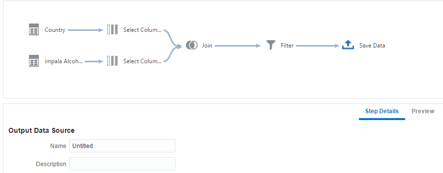
Now I have my data sources in the Data Visualization Desktop and I can create my first data flow that compares country name:


And pick the Select Columns:

The system Automatically adds all the columns, so i select "Remove All" pick the "Country" column and press "Add selected":

In "Preview" I can see the data:

Now I want to bring the Impala source and do the same:
Another Right Click on the last step (Select Columns), 'add step' and selecting 'Add Data', does that:

I have 2 data flows I want to join. The trick is select one and press Ctrl+Right Click on the other. Now we have the join option:


Our case is simple (country = Country), in other cases we can select the columns and pres the Plus mark on the right to add one more pair.
To check the country names that don't fit we want a full outer join. For non technical people it's "All rows" vs. "Matching rows":


Now I can add the filter (country is Null or the other country is Null):

Last part of the data flow is to save the data:
I didn't bother saving the data flow. What I did next is to export the thing to excel and create if-then-else statement. Something like this:
CASE Country
WHEN 'Bolivia (Plurinational State of)' THEN 'Bolivia'
WHEN 'Brunei Darussalam' THEN 'Brunei'
WHEN 'Democratic People''s Republic of Korea' THEN 'South Korea'
WHEN 'Iran (Islamic Republic of)' THEN 'Iran'
WHEN 'Micronesia (Federated States of)' THEN 'Federated States of Micronesia'
WHEN 'Lao People''s Democratic Republic' THEN 'Laos'
WHEN 'Syrian Arab Republic' THEN 'Syria'
WHEN 'United Kingdom of Great Britain and Northern Ireland' THEN 'United Kingdom'
WHEN 'The former Yugoslav republic of Macedonia' THEN 'Macedonia'
WHEN 'Venezuela (Bolivarian Republic of)' THEN 'Venezuela'
WHEN 'Congo' THEN 'Republic of the Congo'
WHEN 'Republic of Korea' THEN 'North Korea'
ELSE Country
END
I used it in the next part, where I combined all the data sources.
I could create a project and do the joins there, but I preferred to have a data flow that creates a reusable single data source of all the data.
The only new things I did in the second data flow, was to create a column (based on the above case statement) and renamed few columns.

Lets talk about the last steps of this data flow:

After the join and selecting only the relevant columns, we have to define the Aggregate function of the measures. We often use sum. In our case, there is no point in aggregating alcohol consumption in countries so I mostly use Avg:

Now I have a new data source, named United Alcohol. Lets have fun.

Can you guess what region consumes the largest amount of alcohol? Europe of course, when Eastern Europe is on your side you will always win this "game". Not surprisingly, the Eastern Mediterranean countries (that are mostly Muslims) consume very little alcohol. (The number are amount of pure alcohol per person a year).

If you wanted to know what is the most popular alcoholic type of drink around the world, we have the answer:

Looking at maps of Total Alcohol Consumption, 2 types of Alcohol prices, % of Alcohol dependence and Alcohol attributable fractions, all causes deaths (%) shows me few interesting things:

2. Norway alcohol prices are very high, but it didn't help them with Alcohol dependence and slightly with it's consumption comparing to other Scandinavian countries.
So lets see whats going on in Europe.
Here is a chart of Total Alcohol Consumption vs. Alcohol dependency in European Countries with Polynomial Trend Line.


Belarus, Russia and Hungary on one side and Tajikistan, Turkey and Azerbaijan on the other. Other Outlier model include Israel as well (the regions are not geographical).
Last thing I will do with Europe, is to set the size of the bubble to show the percent of deaths attributable to Alcohol. The strange thing I see, is that the high percent of deaths attributable to Alcohol is not directly connected to consumption. It seems that the geography is the main factor. If you are from ex-USSR republic, you have high chance to die with something related to alcohol. Belarus is leading with 34.7%! Hungary that is the same cluster of Alcoholism and Consumption, reports 6.7%, by far less then Ukraine, Latvia, Lithuania, Moldova, Estonia...

Lets see it on the map:


The part that really surprised me was when I split the percent of deaths attributable to Alcohol by gender. In countries where the percentage is highest more Woman than Men death is attributable to Alcohol!

I could continue on and on, but lets stop here. Wish you a happy new year and "С новым годом" if you prefer Russian. Lets finish with this Merry Christmas video using Oracle Data Visualization:https://youtu.be/NTtIsifOJoE